

Microsoft Rewards Community Page
The Community Page was intended to be a space within Microsoft Rewards to allow a user to have a personal community network to interact with, compete against, and create communal bonding throughout the Microsoft Rewards program.
After the project was completed, it was eventually abandoned in development except for the Rewards Referral Program which was part of the original project.
- ClientMicrosoft - Bing
- RoleUI / UX Design Lead
- Team1 Project Manager, 1 Designer
The Community Page was an idea that partially existed in the Microsoft Rewards dashboard but served no purpose and had no real functionality. Building off the original design files to make a cohesive and full experience.
Working with the PM partner, we needed to finally take this idea and really create the framework and user experience of the community page and create realistic goals that would be useful to the users.
After creating the new UX and full end to end scenarios, I then need to create new designs to properly fit within the Microsoft Rewards Dashboard to create cohesion and to ensure that the users had a familiar experience.
To establish a space within Microsoft Rewards to allow a user to have a personal community network to interact with, compete against, and communal bonding. The community network will allow the user to be connected to others throughout all of the Rewards endpoints through Microsoft Accounts page (e.x. Xbox)

Refer a friend
Earn more points through referrals, increase Microsoft Rewards users, and help create a social community around Microsoft Rewards points that gives points to both the referral and the referee.

Ask/Give Points
To help promote the aspect of your community, we wanted to test out a feature that would allow you to both ask and give points to help meet your Rewards goals and bring a sense of sharing amongst your Rewards experience.

Fundraising
Prior to the creation of the Give with Bing page, the initial idea was to use the community page to help promote fundraisers to use Rewards points as a donation since it was an under utilized featured of Microsoft Rewards.
With the initial wireframing based off the PM asks for additional functionality, I had a concerns that the addition of fundraiser into the community page doesn’t fit with the narrative of leaderboard and that the functionality that goes with a personal community, and the functionality of fundraisers are heavy handed.
To try to combat my concerns, I came up with 3 main variations that would try to help address those concerns and start the conversation on the best scenarios.
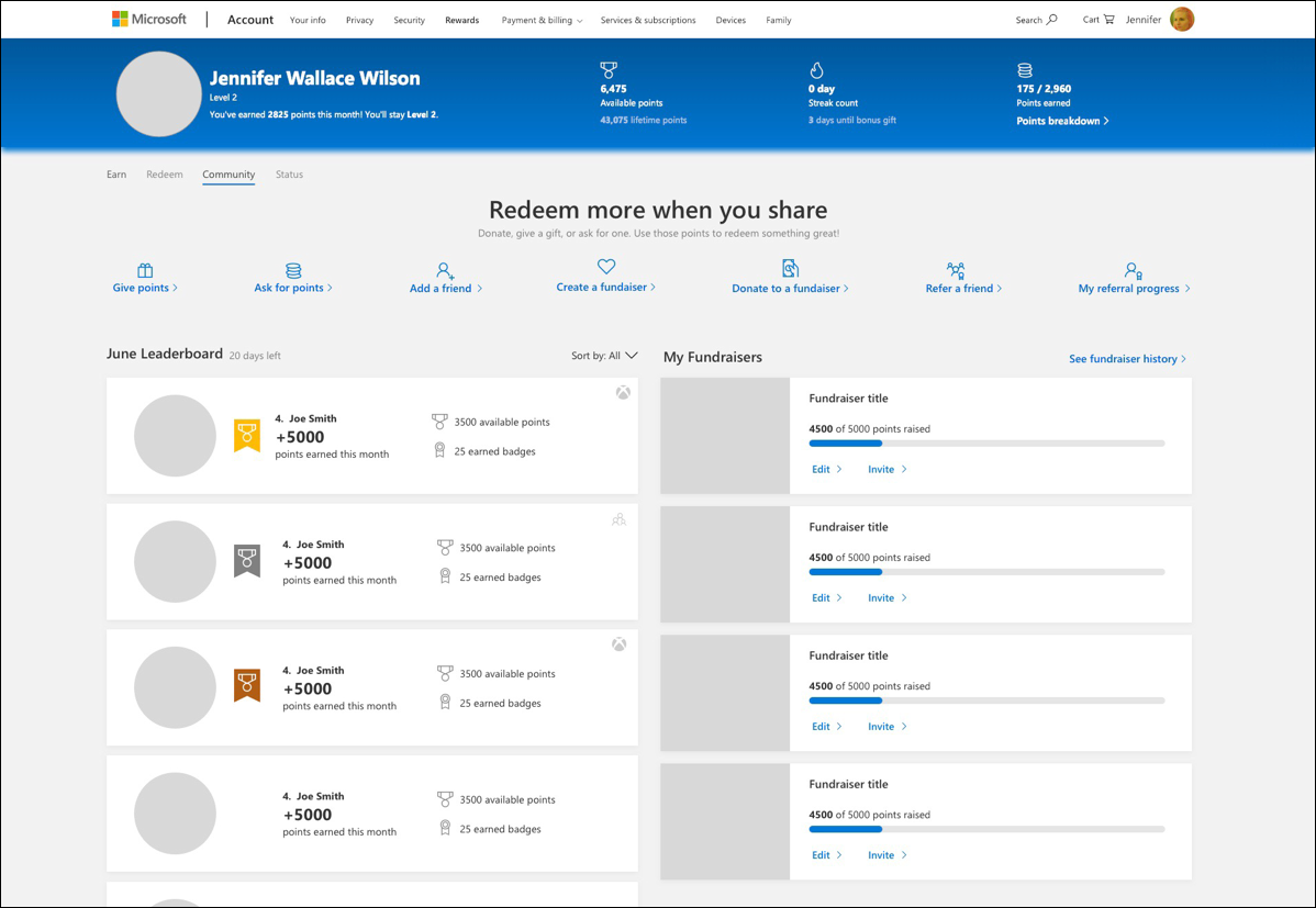
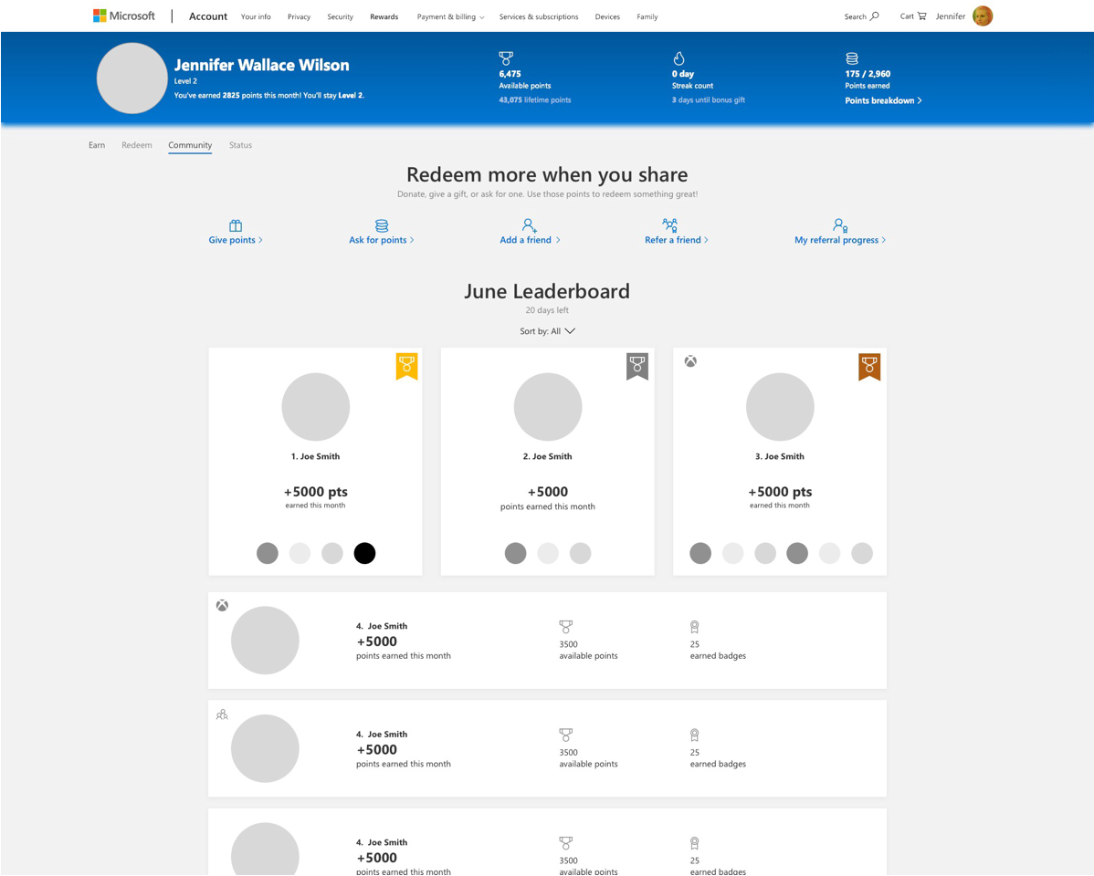
In this version, we wanted to have more of a leaderboard promotion with having a special treatment of the top 3 for that months leaderboard in your community. This would also include showing your fundraisers and suggested fundraisers from your friends to promote giving with Microsoft Rewards Points. The Refer a Friend feature is downgraded into a pop-up feature.
Pros
- Might give better sense of community through the friend generated fundraisers
- One hub for several bits content with some similar functions
- Create returning value to the community page by having fundraisers to promote return engagement.
Cons
- It is a much busier page with all the elements
- Refer a friend progress has to be downgraded to pop-up – fear the visual engagement reminder might affect engagement in refer a friend action
- Fundraiser still does feel out of place
- Limitations to scalability of the page due to many areas shoved into one area
- Concerns on flexibility of design for mobile
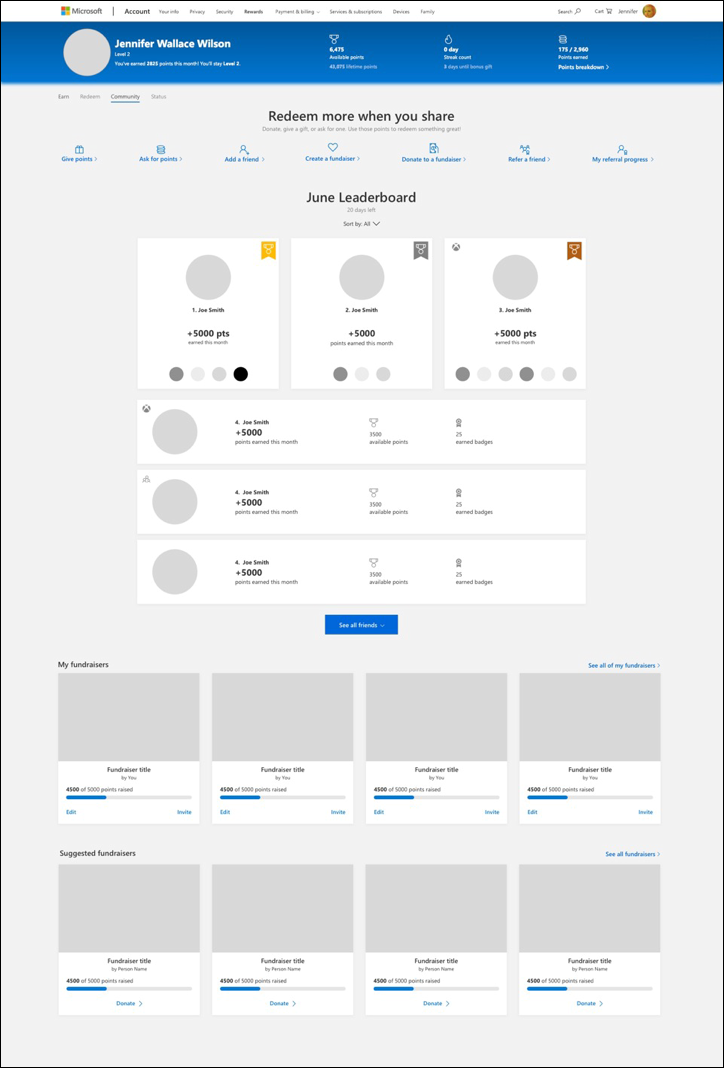
In the Leaderboard only version, the community page stays focused on the users friends and family list to help build a proper and engaging Rewards social community. The focus will be on the Leaderboard, referring a friend which will stay more visible in some variations and focus on the community page actions to help build up your social place.
Pros
- Gives more breathing room to content, easier to parse
- Doesn’t feel crowded with diverse content
- Allows for scalability in features for creating a social network within Rewards for future endeavors
Cons
- Repetition of GIVE points function in several areas in Rewards dashboard can cause behavior confusion
- Concerns that their isn’t enough here for reoccurring engagement as is


The fundraiser page allows a proper dedicated space for a feature that requires far more dedicated functionality and focus. With all the features wanted for fundraising, it made more sense for a UX prespective to have it be it’s own feature.
Pros
- Dedicated fundraiser page helps create desire of social good push for Microsoft Rewards
- Allows fundraisers to have more proper functionality with a dedicated space
- Creates more future opportunity and growth for Social Good
Cons
- Might feel disconnected and confusing because of the community page
- Creates another area where a user can GIVE points, might not want several areas competing (giving points to friends in community, give points in fundraiser, give points to charity in redeem)
- Disconnect from users friends list who might have created their own fundraisers. Would I see their fundraisers in this page but not in my leaderboard?
Ultimately, we decided to remove fundraising from the Community page because there ended up being a bigger push for a single dedicated experience in regards to donations which turned into the Give with Bing program.

Due to having to follow strict guidelines to follow the exact same design patterns of the Rewards dashboard, there wasn’t much wiggle room in the design once the main wireframe layout was chosen.
The community page had 3 main “home” experiences depending on the user flow.
- The user has no community and hasn’t made any referrals
- The user has has made referrals, but they aren’t added to their community
- The user has a community and either they have a referral tracker or referral upsell.


I had a few UX flows on the possible experience for asking / giving points, but it was mostly different due to the entry point to start the experience and how the asks might be displayed.


Since the Microsoft Rewards dashboard is built on responsive design. I had to make adjustments to the designs for the smaller screen sizes to ensure the best experience on multiple devices and screens.
This also included making detailed redlines for engineering to follow to ensure the high level of fidelity needed for our experience.


