Vancouver Audubon Society Logo + Branding
My father is a member of the Vancouver, WA Audubon chapter. They desperately needed a logo so I offered to donate my services to create them a logo and some branding. Each chapter is given a specific bird and their chapter bird is the Steller’s Jay.
- CLIENTVancouver Audubon Society
- ROLELogo / Branding designer
The chapter wasn’t sure what they really wanted, so I had free reign to explore many different options to try to get an idea of what would work best for their needs and help them look more professional compared to other chapters.
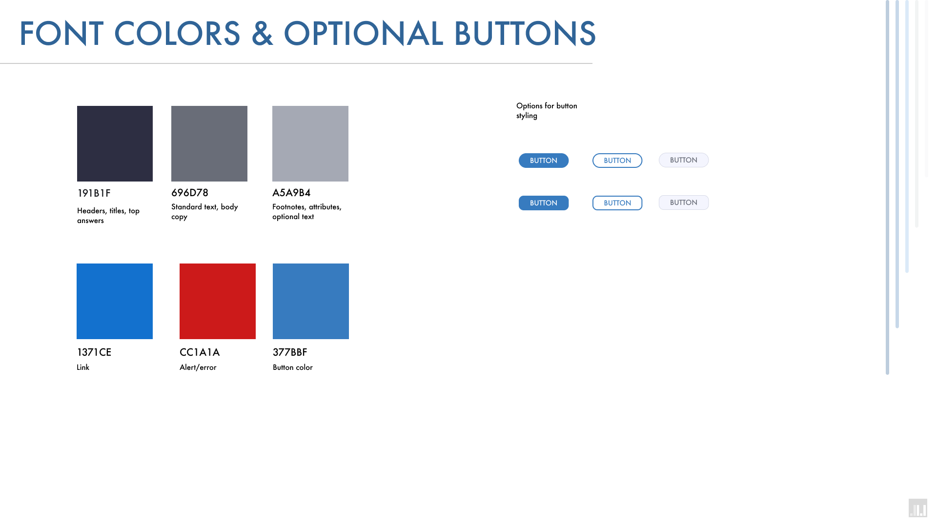
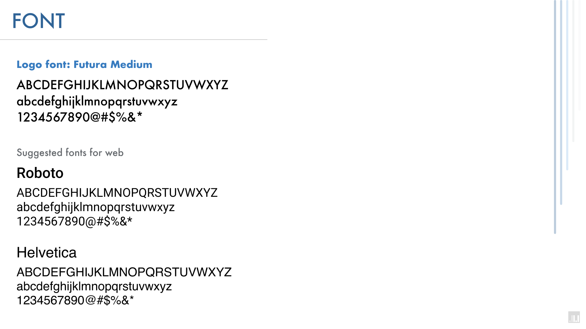
Once a logo was selected, I would need to create a branding document for them to provide all the information they needed to use their logo in both print and web formats.
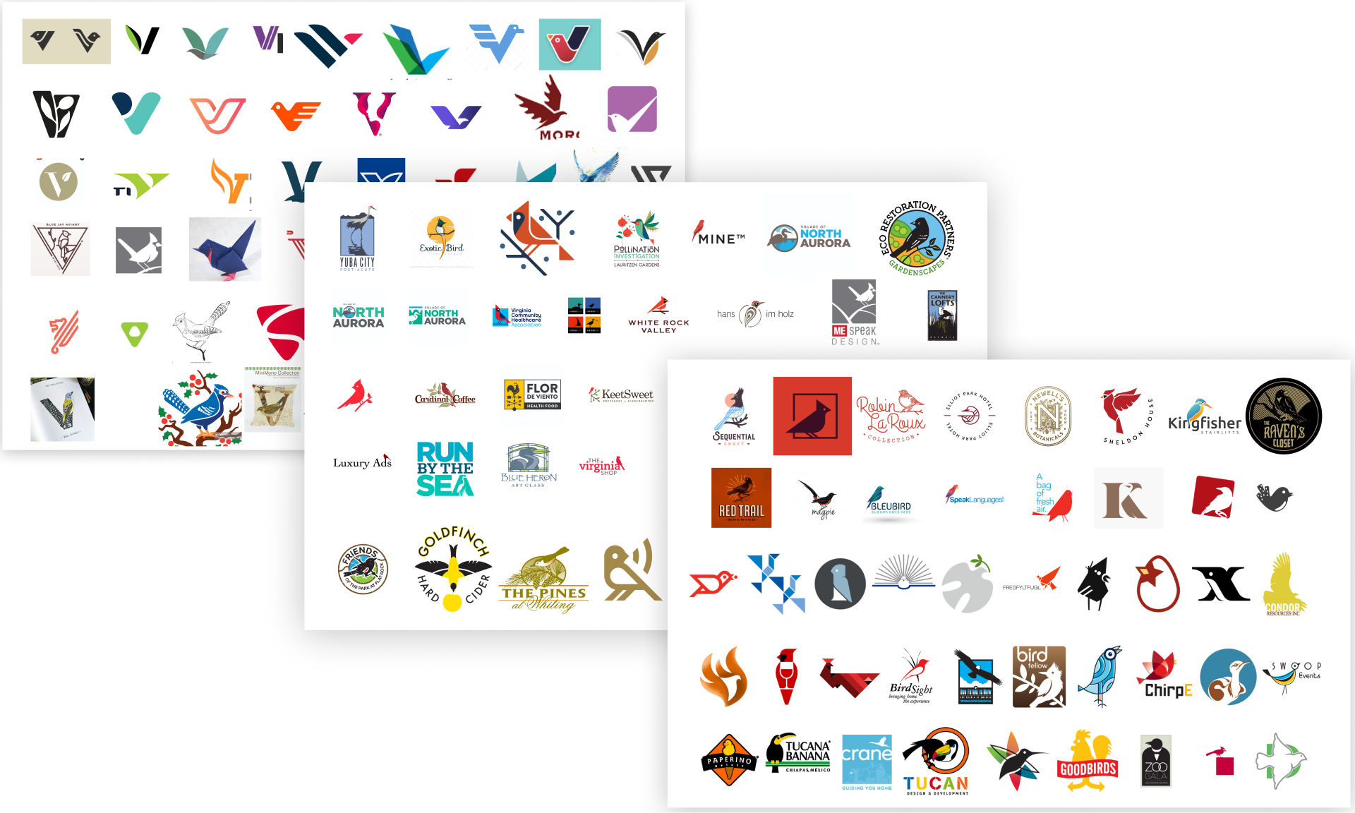
RESEARCH & EXPLORATION
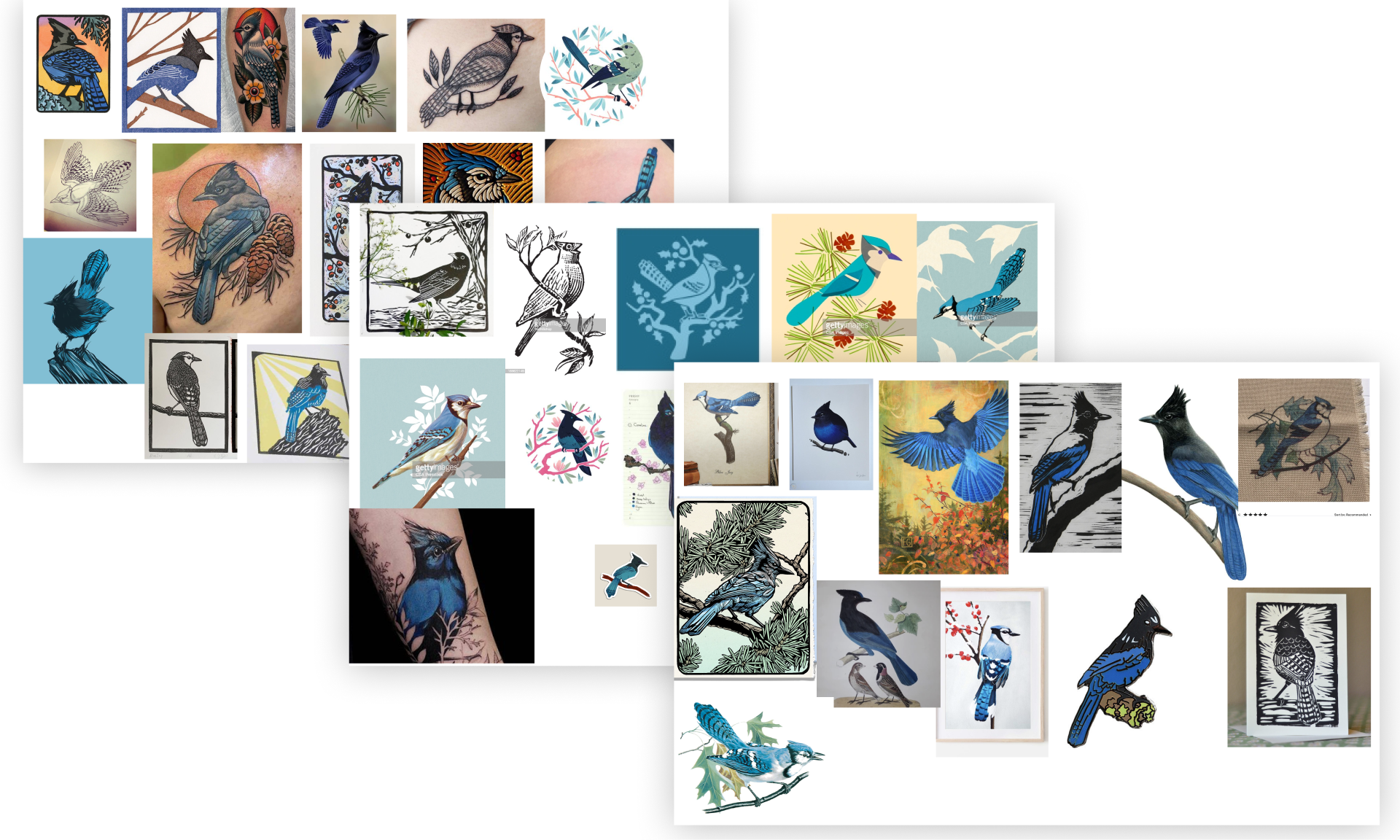
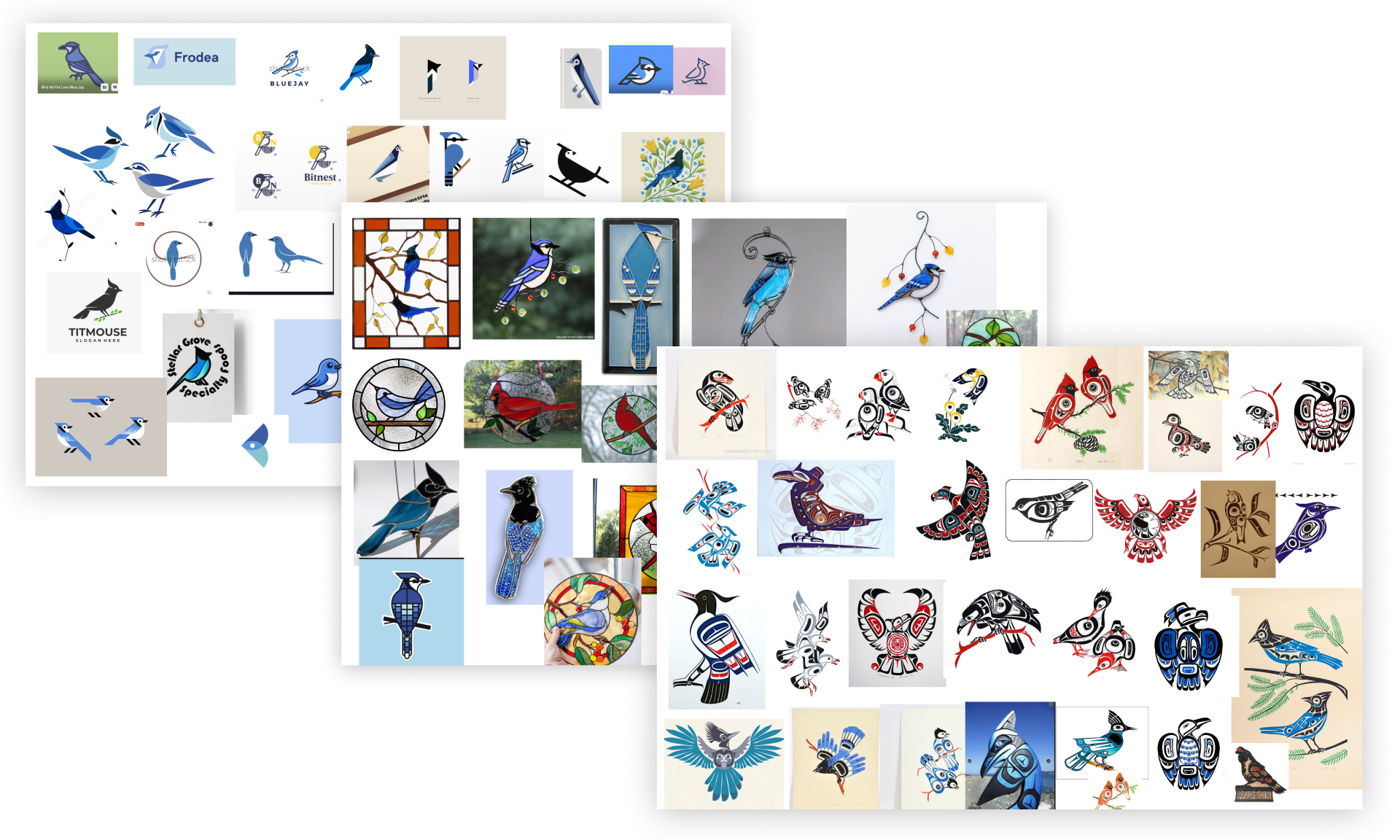
I really wanted to make sure I covered all my bases. So I did extensive research on the logos being used by other Audubon chapters, logos/vectors/illustrations of birds & jays, and wildlife photography to capture the body of a Steller’s Jay.

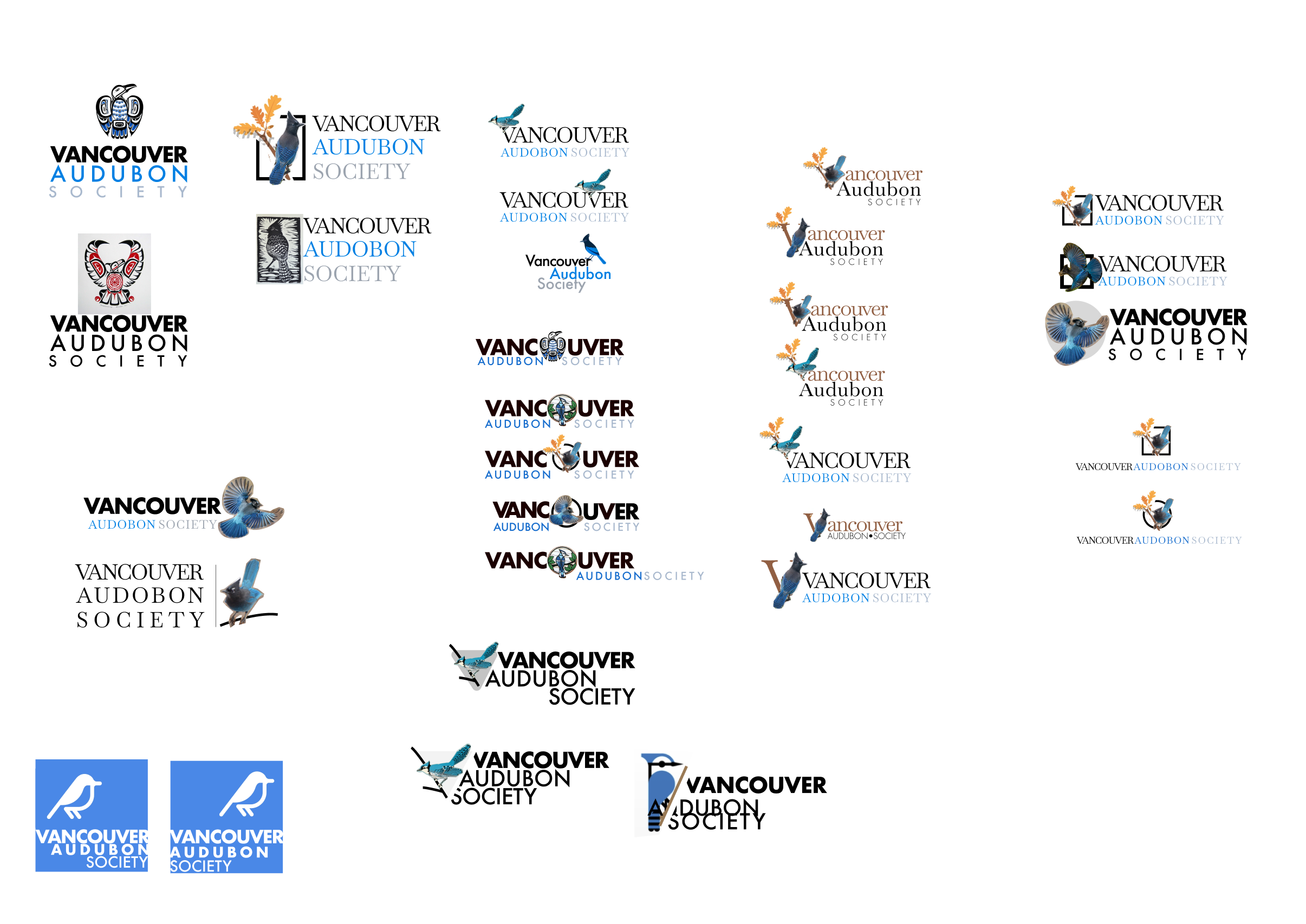
After compiling the logos into more final looks, I submitted these following logos as ones to chose from but with the ability to chose an option(s) and expand on them.
You can go and see the detail of each submitted logo to see what the inspiration and thinking behind each one was.

Drawing influence from the art style of the Pacific Northwest Native Americans, this design is paying homage to the peoples of the land and the respect they have for nature. This style is called Haida which comes from the Haida people from the coast of British Columbia, Canada

This style pulled from emblems but more notably enamel pins. It adds in some detail but has to still stay simple. The tail feathers break out of the circle to create depth and uniqueness.

Taking the same “BREAKOUT” design, removing the tail from breaking out of the frame to create a cleaner look and allow for wrapped text to create more of a badge style logo.

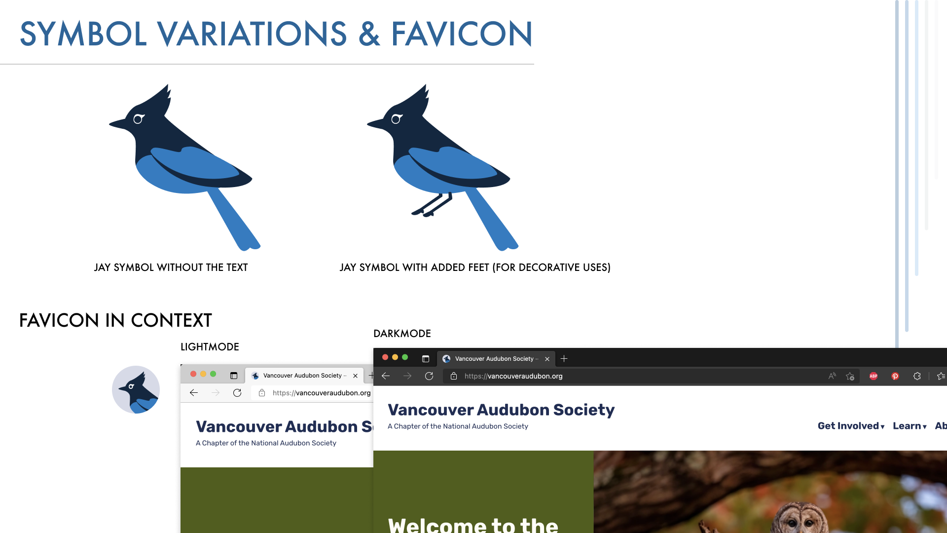
By using the jay sitting on a branch at an angle, I replace the “V” in “Vancouver” with the bird itself to create a hybrid logo and to create an individual symbol that shows a “V” shape to represent the Vancouver Audubon society in other applications.

Taking the same V- shaped Jay illustration, I placed it in a frame to create a simple logo mark for a cleaner lockup with the text while still having the tail feathers break out of the frame to add in depth.

I wanted to make sure we had a few very simple birds as an additional option. Here the jay is made with simple lines and blocked colors. Since our jay is simple, I did a more interesting lockup of the text to add in an additional simple visually interesting element.

Inspired by papercraft art, this design utilizes simple shapes and colors and contained lock ups. This helps create an easy to register image for the logo that works at many sizes. The lock-up helps balance out the long name.

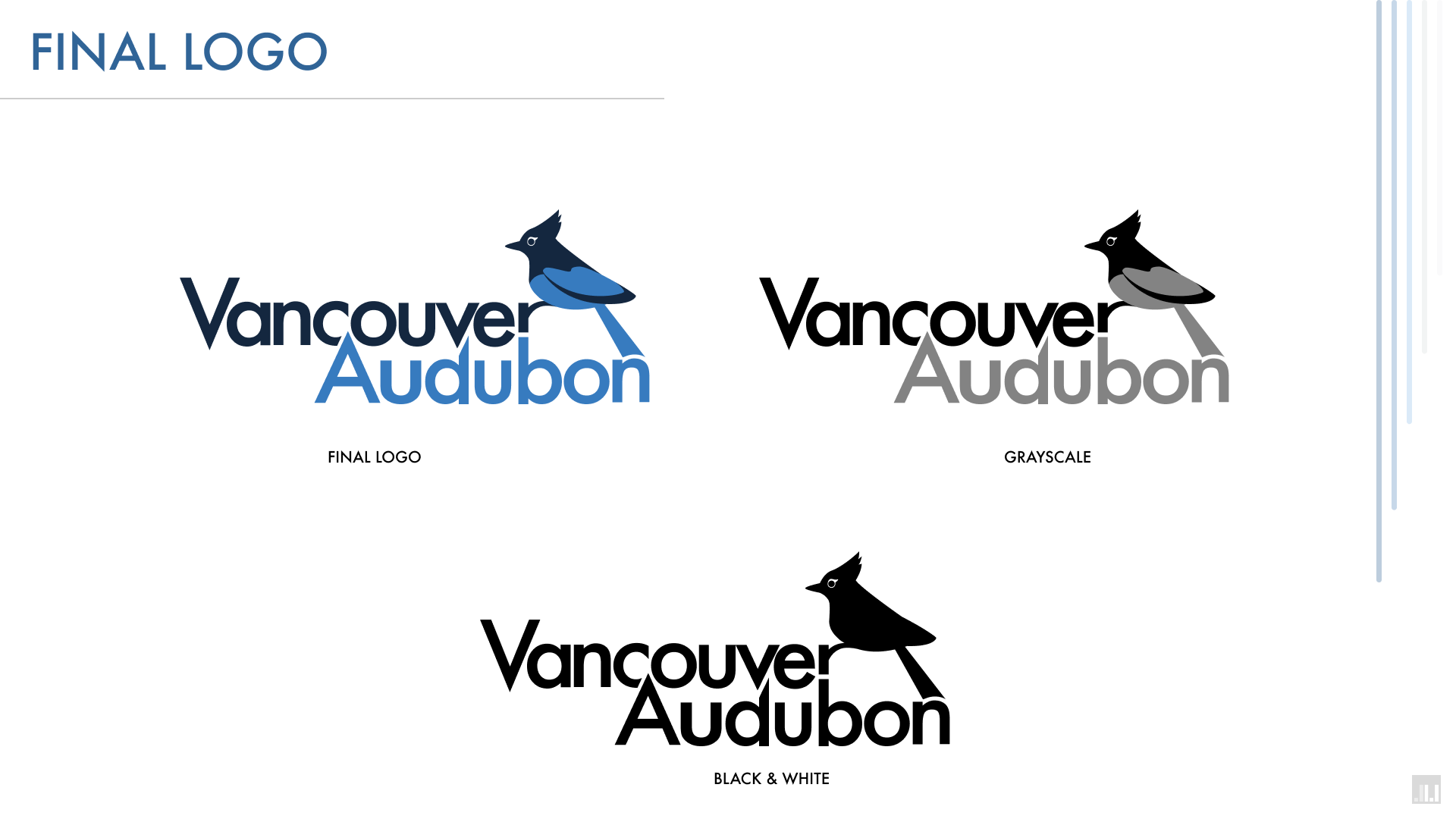
FINAL LOGO & BRANDING
The chapter board decided to do a blend of the Line-art and Papercraft style logos for their final logo. So once that was squared away, I created their branding document and all relevant files for them to use at their leisure.