
Windows Search Box
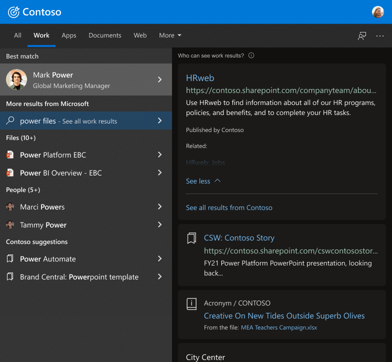
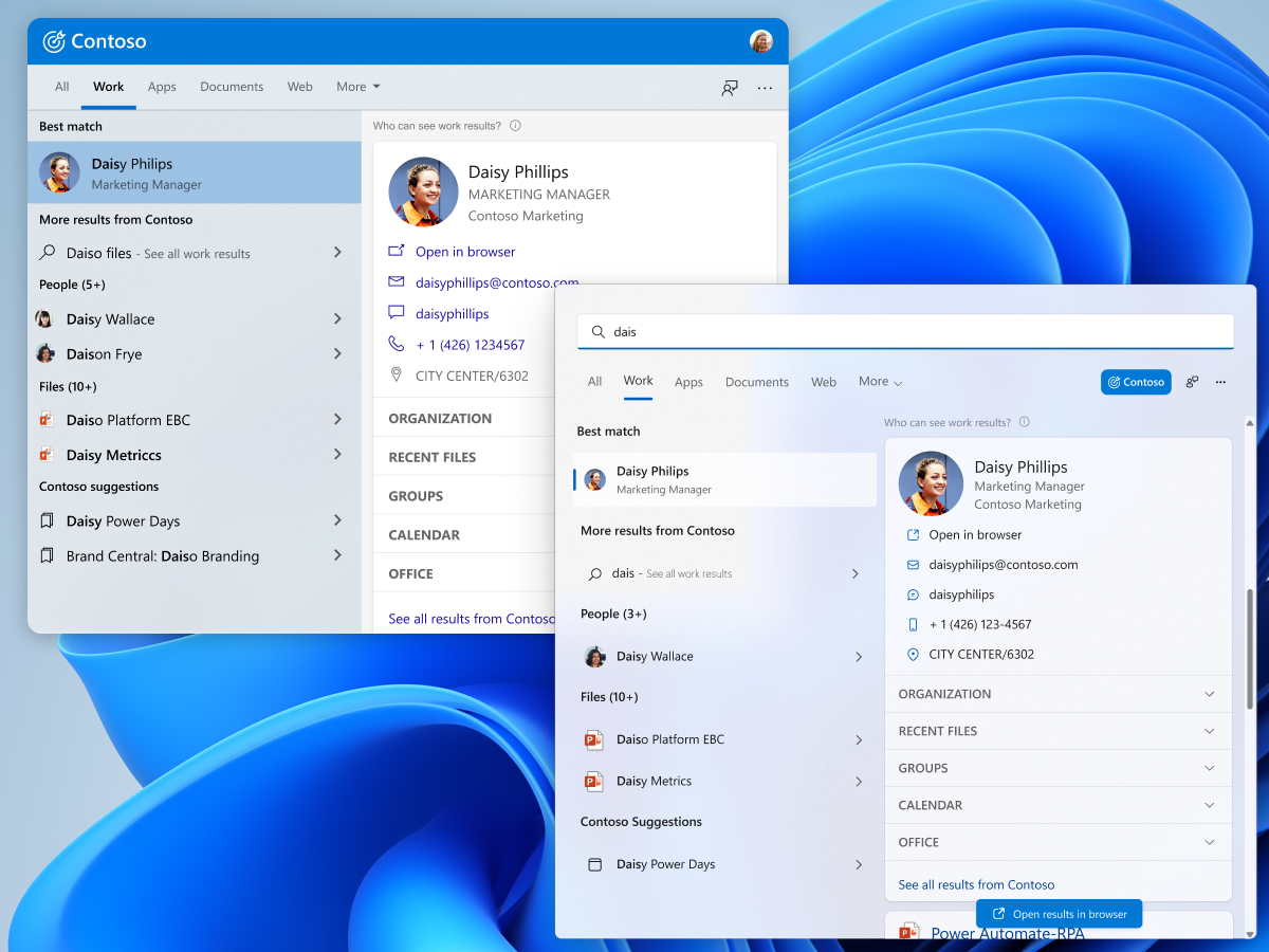
I worked on the full implementation of Microsoft Search for Business within the Windows Search Box platform. This was a very extensive project since it needed to span both Windows 10 and Windows 11. This also required cross-team collaboration and user testing flights prior to shipping it to the overall product.
- ROLEDesign Lead
- PlatfomsWindows 10 & 11
- Team3 Project Managers, 6 Engineers
- PartnersWin10 & Win11 WSB teams
Define a clear framework and user scenarios of Microsoft Search for Business and how it can best be optimized for the Windows Search Box.
Design solutions where work search can allow for deeper searches, horizontal suggestions, and create less barriers for users to get what they need.
Design is data-driven from testing flights direct user testing. We needed to develop several user scenarios to do A/B testing.
Create a cohesive design library with defined systems, templates, components, and branding. This helps future designs to be created efficiently
Defining work-based search in Windows
Microsoft Search empowers people to find the information they need by unlocking knowledge and expertise. Integrated with Microsoft 365, Microsoft Search is a secure, easy-to-manage search experience that works across all your data and platforms to deliver highly relevant results and increase productivity.
What are the main areas that need to be defined?
01.
How to optimize enterprise search in WSB?The search experience will need to be catered to the smaller and more limited canvas and will need the user flow will need to adjust to how users interact within this space.
02.
How will this fit within the ecosystem?Microsoft Search for Business is meant to be a cross product experience. We will need to ensure that the experience and hand-off to other enterprise products is seamless.
03.
Can enterprise search help make WSB more impactful?Using the intrinsic value of this feature, there is an opportunity to help increase engagement and redefine the purpose of the Windows Search Box to be more than to just be used as a local search tool.
Identifying the current user problems
The Windows Search Box (WSB) is a small shared space that has had ongoing problems in it’s user flow and competition for results. I took the time to go through the user problems but hone down to the main 4 issues that will need to be tackled.
01.
Search CompetitionMost searches in WSB are for local files and apps. Relevance and ranking also prioritizes local content.
02.
AwarenessMost users aren’t even aware that either Microsoft Search for Business exists or that they can do cloud-based work searches in WSB.
03.
Web Results BloatBetween 40-50% of results are unrelated web results that takes valuable real estate away from and work-based results.
04.
Old HabitsAlmost all search queries are for local files and apps. This has been the user habit since the creation of the Windows Search Box.
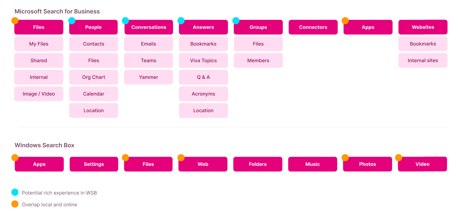
We needed to go through the current WSB and MSB experience to lay out it’s architecture. By doing this, we were able to see what values can be added into WSB directly and what would needed to be handed off to a different product or platform.
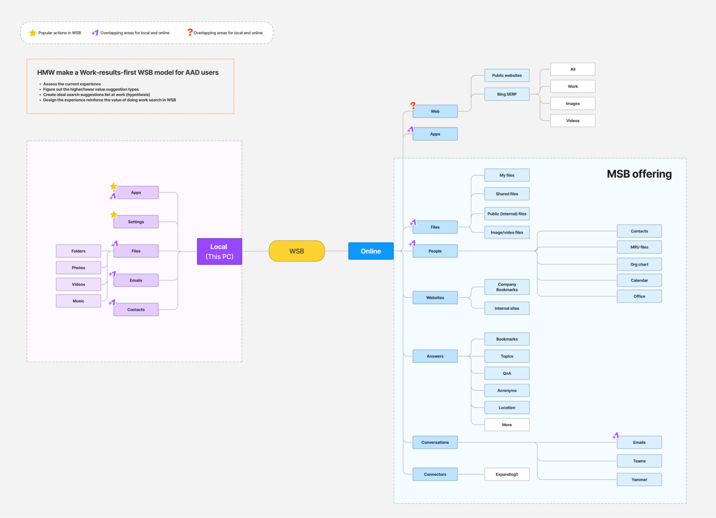
I did an audit of the current user experience in order to identify the current issues in the overall ecosystem. This also was to help both WSB and the product as a whole.
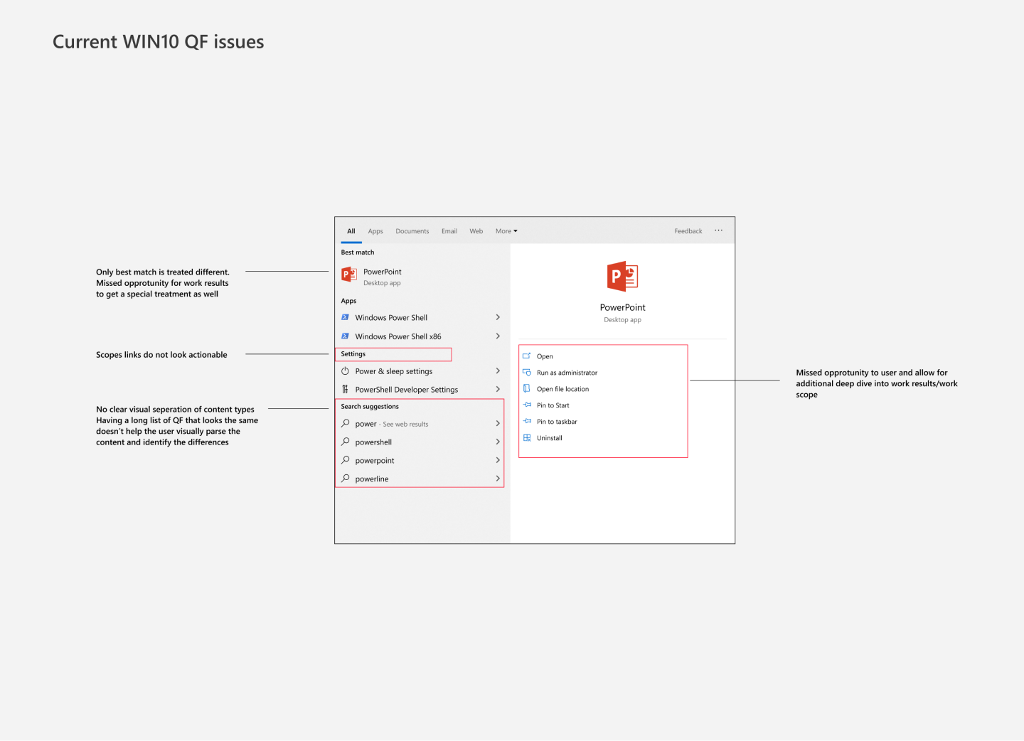
Goals & Framework
Once our problems areas were discovered, I had to lay down the groundwork for the goals and the framework needs of business search in the Windows Search Box
01.
Rich SearchCreate a engaging and deep search experience to create new user habits
02.
CoherenceCreate cohesion of the experience across the MSB ecosystem
03.
Task CompletionIdentify areas where we can help a user complete a task while still in context
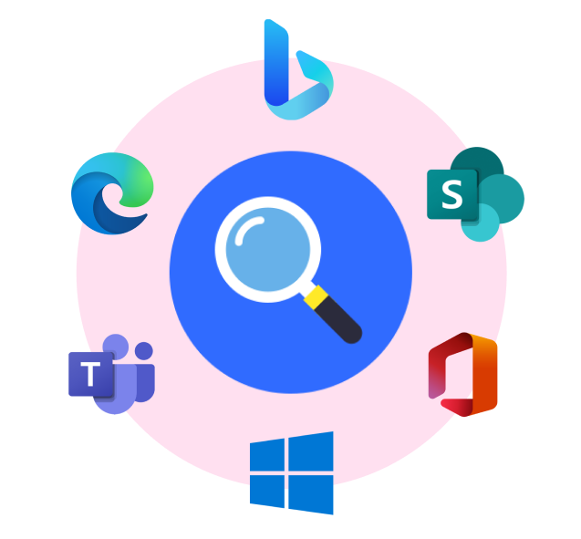
We needed to go through the current WSB and MSB experience to lay out it’s architecture. By doing this, we were able to see what values can be added into WSB directly and what would needed to be handed off to a different product or platform.
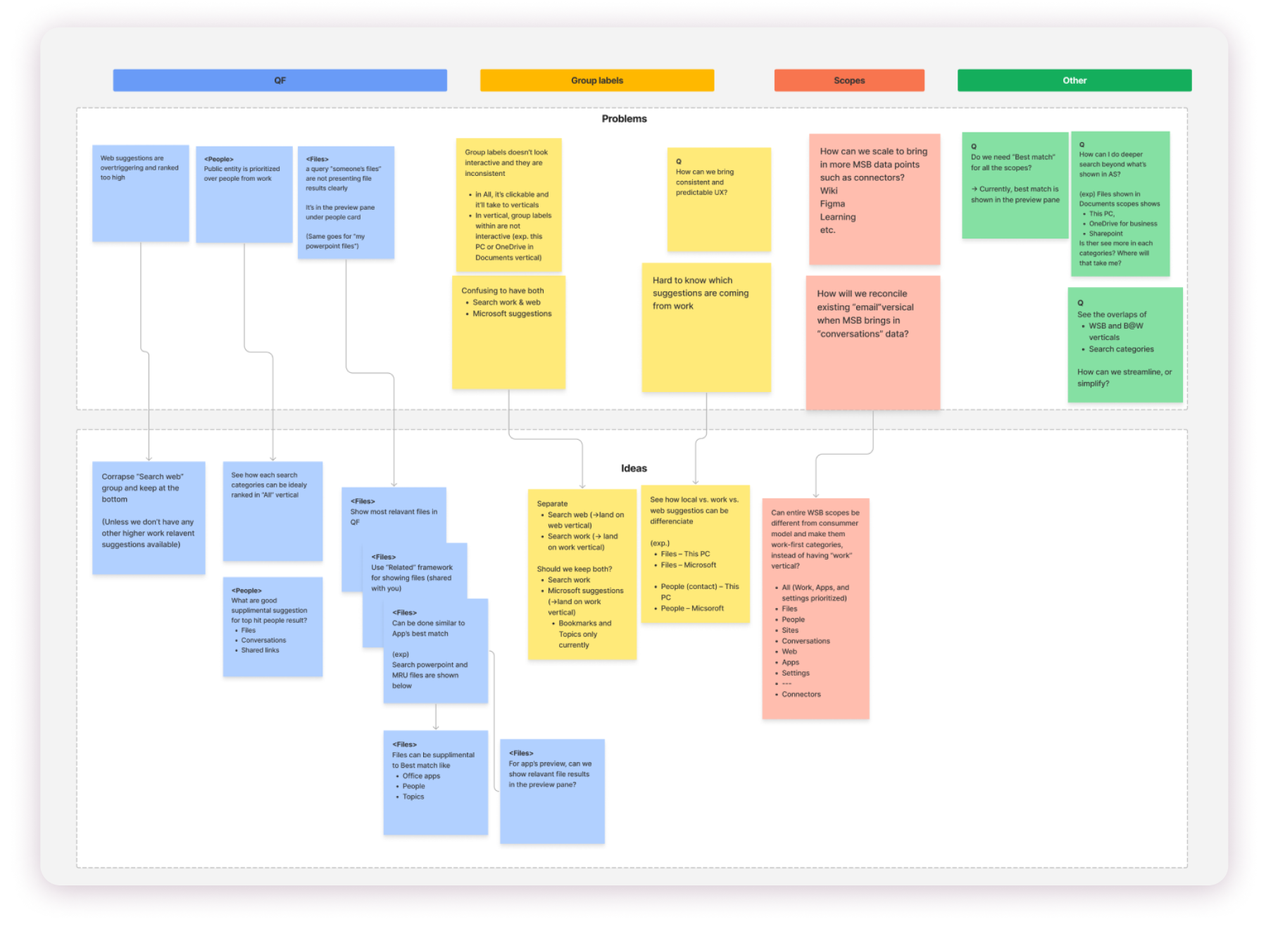
By investigating the current user problems, we were able to do a working session to both clearly label the problems in order to generate potential solutions.
These were the following main pillars that I created from that session:
- Prioritize QF rankings for work searches
- Create a “work mode” to differentiate from consumer side
- Allow for direct handoff that doesn’t lead to web
- Allow 1-2 tiers deeper search on rich answers
USER RESEARCH
In order to achieve our goals, I needed to convince partners to buy into some of the more drastic changes. Since this is a shared space, I needed as much data as I could to start validating my theories on possible design solutions.
I took the main problem areas to run quick user research sessions to validate that these experiences are not ideal and would hinder our product in WSB.

A/B flights with 5000 users over 2 weeks in different regions.
These flights allow us to get data in various markets in a quick manner to start validating theories.
LEARNINGS
- 0.5% increase clicks-thrus on work based searches
- No increase on work-based search queries (non-local)
- Users reported confusion on seeing cloud based content and where it is coming from
We held 2 different video calls sessions with 2 main group
- Current AAD clients (clients who already use Microsoft Search for Business
- Bing Insiders Program (users who have signed up provide feedback)
LEARNINGS
- Users are unclear what is or isn’t coming from work search
- Concerns about privacy
- Users felt overwhelmed by the results pane
- Wanted to stay within WSB for some interactions
The two search areas in WSB
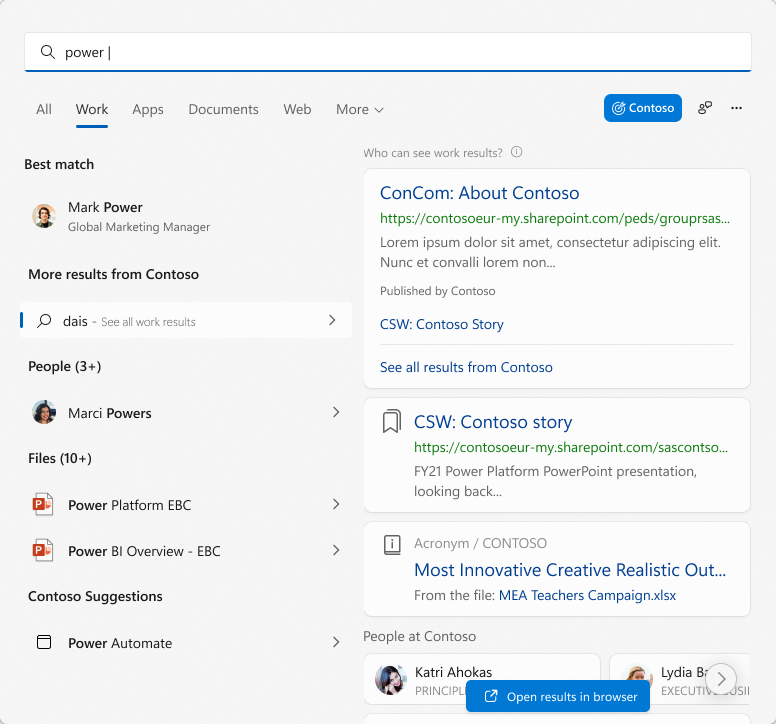
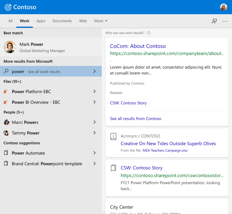
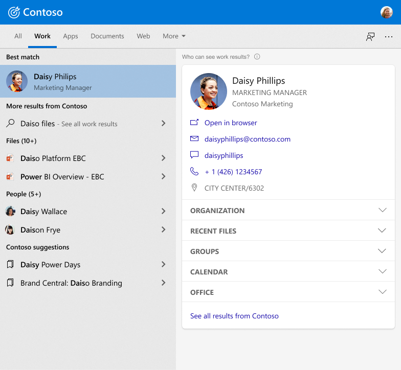
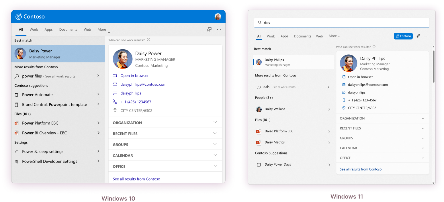
After our research sessions, we were able to move forward to creating the a work centric QF in the ALL tab in addition to making the Work specific tab.
The work centric ALL tab helps curate the search to be more work focused when a user is signed into their AAD account. This also helps separate the experience of WSB from the consumer version.
The benefits of this design includes:
- Prioritizing work results and filtering out results that have caused bloat (i.e unrelated web results)
- Provides a clearer path into the curated Work search tab for both user discovery and help in changing user habit
- Grouping of QF results provides better information on where these results are coming from
- This separates out the work versus consumer version of WSB.
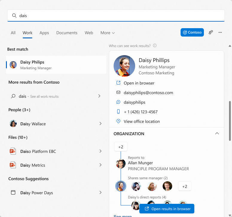
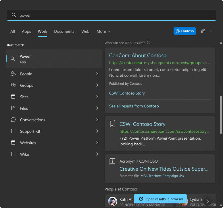
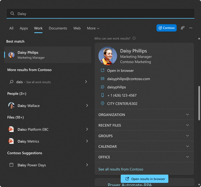
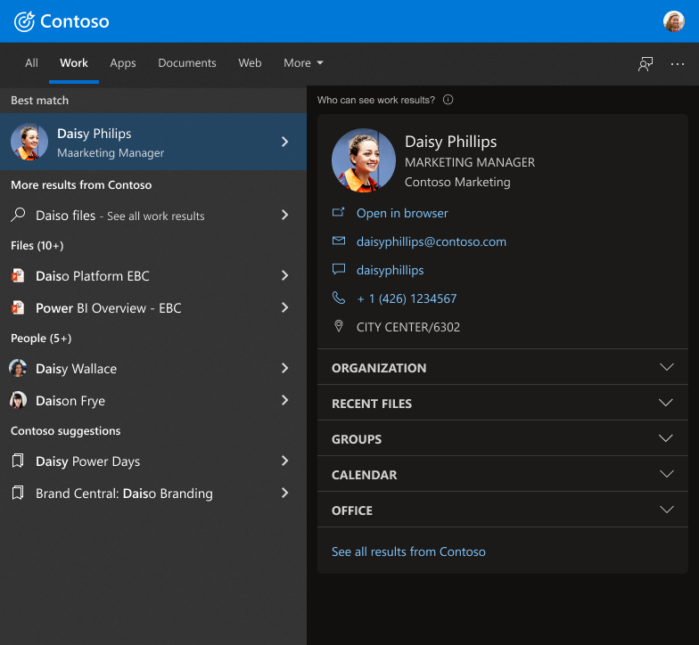
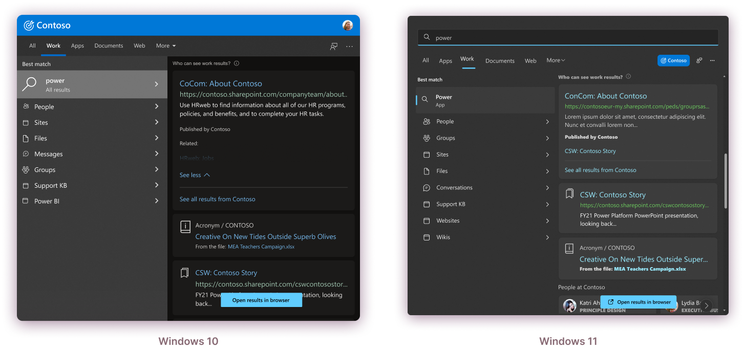
The Work tab allows for a fully filtered and richer experience for work-based searches.
In this area, we can control and curate a deeper, rich search experience.
- We are able to surface the different category types within the search product to provide deeper category searching
- Rich cards and answers can be more interactive and surfaced here.
- There is more contextual search results
- This area allows for 1-2 tiers of diving into experience before handoff outside of WSB
Below is a motion example of how the motion user experience functions in the Work Tab in Windows 11
Below is a motion example of how the motion user experience in the All tab in Windows 10.
BETA Launch & Reception
I left Microsoft before the product fully shipped, but we did so a soft Beta launch to around 35% of our current AAD client users.
The goal of this was to get more of an understanding on user functionality, gather data, and make refinements before full production launch.
We have receive significant positive feedback on the experience.
Work-based search queries increased by 10%
(3 week period)
Click-thrus to the Work vertical on Bing.com increased by 6%
We saw DAU (Daily Active Users) clicking into the Work scope and navigating in that space
Additional Designs
Below are some additional design examples from the WSB search experience that I had created.
DESIGN SYSTEM
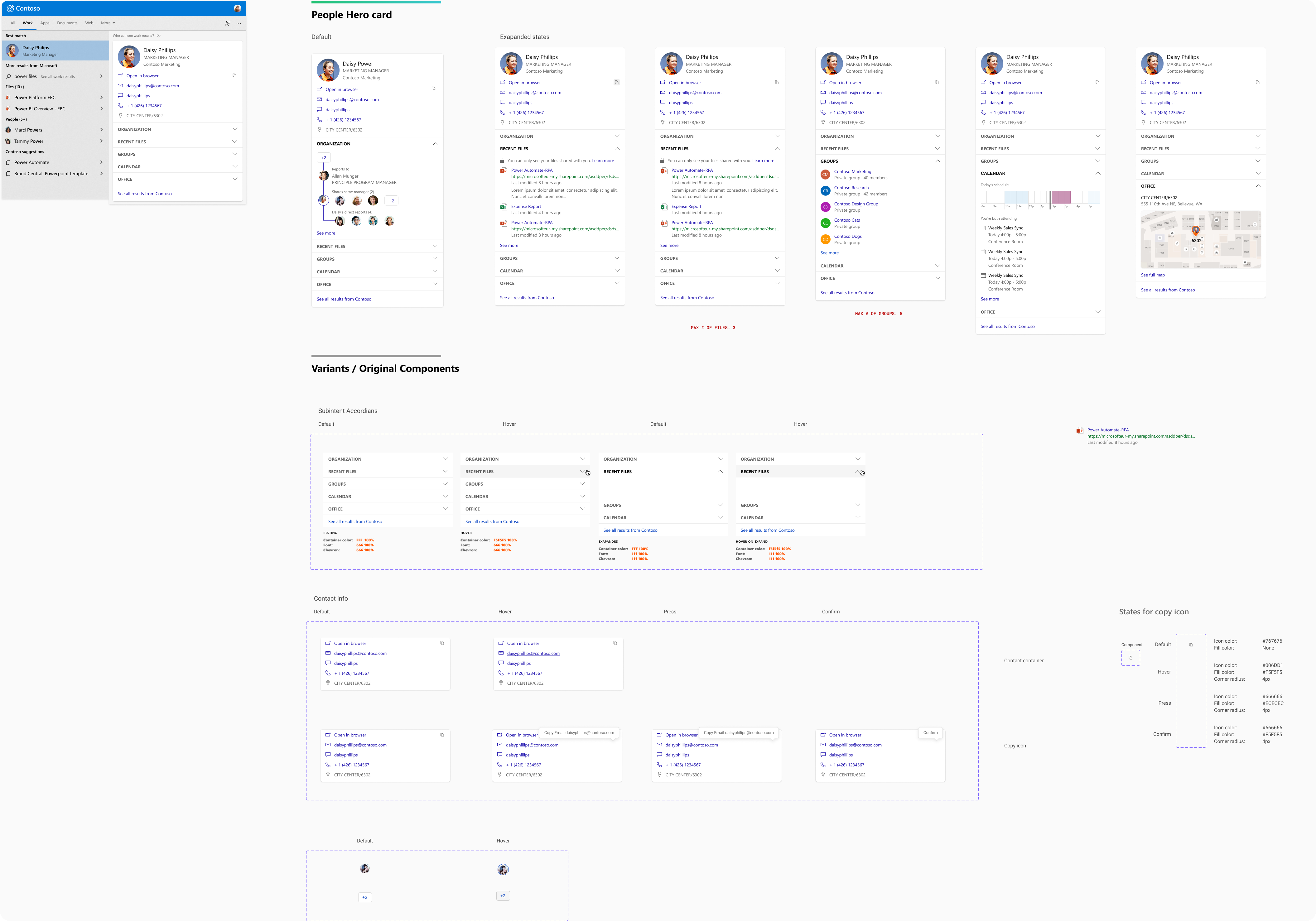
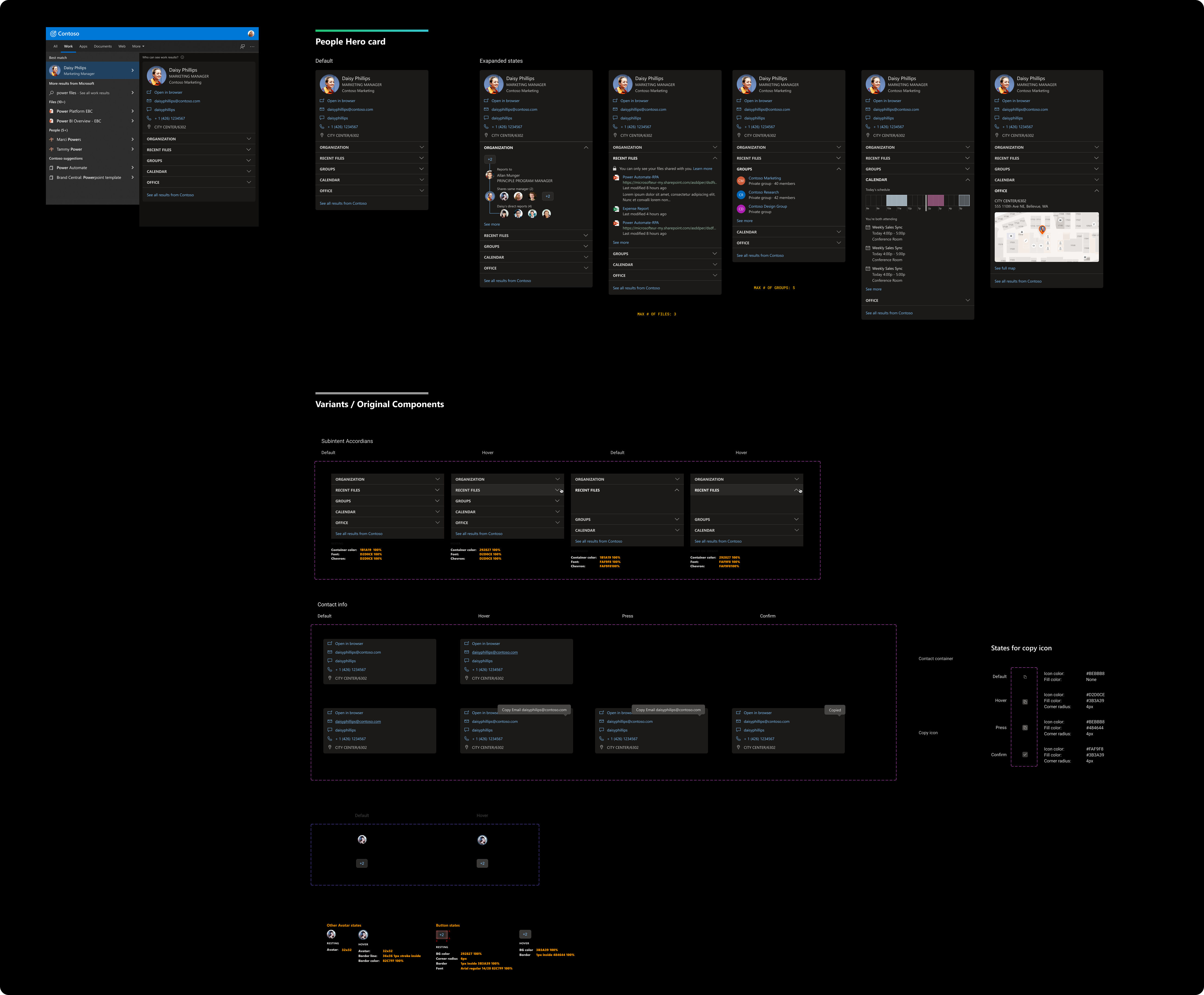
In addition, I was tasked to update and finalize the design system and guidelines for all of the Microsoft Search for Business. I was tasked to make sure that we had a design system that encompassed all of the search designs and functionality throughout the ecosystem.
The design system had several pillars that I established:
- The system showcases every MSB experience throughout all of the M365 and Bing/Edge experiences
- Well documented in showing all states of designs with clear direction for new additional work
- Update designs based off new design systems from Fluent and Windows 11
